
Are design delves reviews? No. I would describe them as explorations. Less "Is this worth buying?" and more "What do these design decisions show?"
In the end, they're an excuse to exercise curiosity, learn, and frankly just fawn over good-looking and fun-to-read games.
Speaking of which...
In the end, they're an excuse to exercise curiosity, learn, and frankly just fawn over good-looking and fun-to-read games.
Speaking of which...
Comments
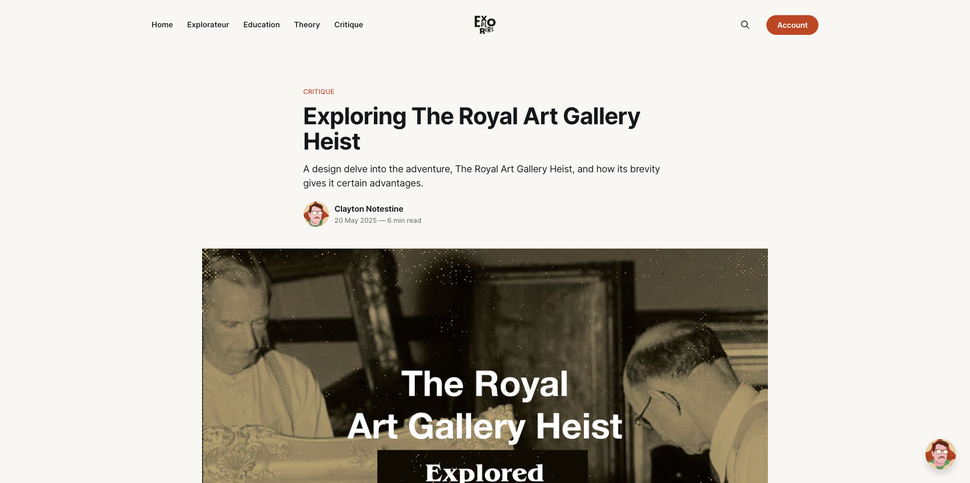
I still do a bit of that. Especially in this delve. Royal uses some iconic fonts to give itself a real bold but clean look that's approachable.
Right now, design delves have three acts: the delve (analysis), the lore (design background), and loot (lessons).
It is short and dense like most micro adventures, but it's laid out with type and graphics that are orderly, spacious, and clean.
This makes it a visual outlier within the form factor.
But this game's visual design serves a different kind of game design.
How does it land? Like most small form factor adventures—with a few bruises, cut corners, and tantalizing what-ifs.
But here's the loot...
My takeaway in this latest design delve is that micro-adventures are often imperfect, but I'm more likely to tolerate their shortcoming, because they're easy to fix.
The shorter the adventure, the more slack you get.