When I was on Twitter, I used to breakdown games into their visual design components. Things like format (page size), typefaces (fonts), art, and layout.
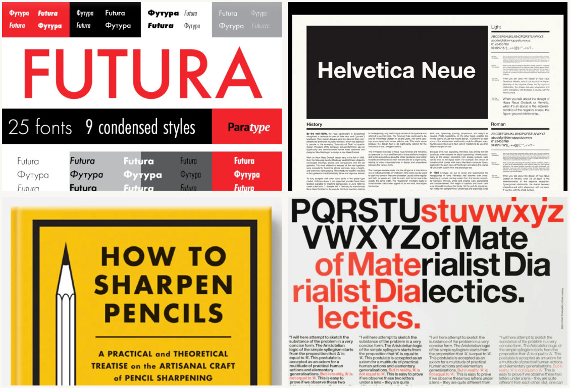
I still do a bit of that. Especially in this delve. Royal uses some iconic fonts to give itself a real bold but clean look that's approachable.
I still do a bit of that. Especially in this delve. Royal uses some iconic fonts to give itself a real bold but clean look that's approachable.
Comments
Right now, design delves have three acts: the delve (analysis), the lore (design background), and loot (lessons).
It is short and dense like most micro adventures, but it's laid out with type and graphics that are orderly, spacious, and clean.
This makes it a visual outlier within the form factor.
But this game's visual design serves a different kind of game design.
How does it land? Like most small form factor adventures—with a few bruises, cut corners, and tantalizing what-ifs.
But here's the loot...
My takeaway in this latest design delve is that micro-adventures are often imperfect, but I'm more likely to tolerate their shortcoming, because they're easy to fix.
The shorter the adventure, the more slack you get.
https://www.explorersdesign.com/exploring-royal-art-gallery-heist/