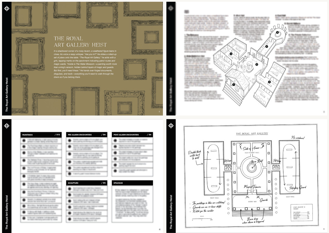
The thing that got me interested about The Royal Art Gallery Heist was this inherent tension in the work.
It is short and dense like most micro adventures, but it's laid out with type and graphics that are orderly, spacious, and clean.
This makes it a visual outlier within the form factor.
It is short and dense like most micro adventures, but it's laid out with type and graphics that are orderly, spacious, and clean.
This makes it a visual outlier within the form factor.
Comments
But this game's visual design serves a different kind of game design.
How does it land? Like most small form factor adventures—with a few bruises, cut corners, and tantalizing what-ifs.
But here's the loot...
My takeaway in this latest design delve is that micro-adventures are often imperfect, but I'm more likely to tolerate their shortcoming, because they're easy to fix.
The shorter the adventure, the more slack you get.
https://www.explorersdesign.com/exploring-royal-art-gallery-heist/