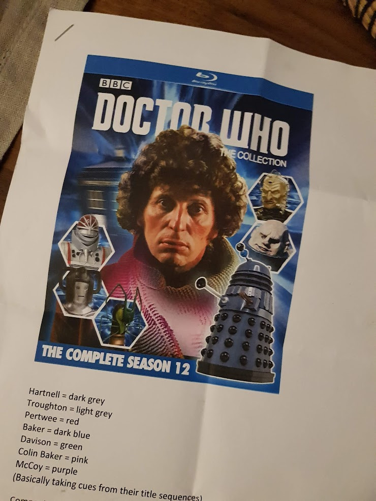
Today marks seven years to the DAY I got the first briefing for Doctor Who Collection. Here's the first page, where they said 'can you do something like this?' and I went 'um, sure? Leave it with me...'
Comments
Log in with your Bluesky account to leave a comment
Obviously you explored a different style design ❤️, I wonder were you tempted by the idea to keep a colour scheme for each Doctor so the sets looked distinct ?
Where did the grey base originate in terms of a starting point and also why do some sets come out a ever so slightly different shade? The DVDs did the same thing too so isn’t a criticism but just an intriguing quirk
ooh many questions. Right, the slight change in shades is a printer thing. we do try and quality control as much as possible, but there's always going to be a 3% variance. As for why grey in the first place, I tried all the usual sci fi colours and it didn't look classy enough.
That’s very understandable. And I think landing on the grey was a great outcome. Really allows the other colours to pop and separates them from other things on the shelf. Thanks for all your hard work and care. Really does pay off!
I don’t hate his design. But it’s fairly basic and looks more like a magazine cover. Where as your designs look so special and pristine and elegant and certainly makes it feel like it’s a elegant deluxe product. Great work on each set as well as the Blake’s 7 set
Wait, just so we're clear I'm not dunking on this design. I just saw it different in my head, and the team behind it were awesome enough to let me do what I do. But really glad that you're enjoying the design I came up with! You're all lovely.
I'm guessing this pitch doc was from pre-Series 11 because it's using the Moffat logo so regardless, I think they were leaning to using the current logo across ranges, including Classic Who, even then as became the case post-S11 & to be fair, the logo could have lasted longer than it did.
Although, I do agree that it was more likely if the range was successful they'd be producing it beyond the lifetime of the Chibnall logo but I get the brand logic. I'd have preferred the McGann logo but that's huge bias cause it's my fav.
Yah i susppose, but no logo has lasted more then a few years, I guess Moffats logo lasted the longest? ,just seemed dumb for s classic product to have the new logo, goes against everything they'd done before for classic products
That was a decision from the production team at the time. I think prior to that, there was always a 'current' and a 'classic' option (usually the McGann logo), and maybe this was a drive to unify everything being produced.
At the time I thought it odd. But then I actually end up associating this logo more with these sets than I do with Jodie’s series itself. I think it’s a very clean and sleek logo that has a bit of class which fits really well with the design of these sets that I’m not sure a bigger logo would have
I don't think it was stupid at all. The Jodie logo/lettering is stylish and classy, and a huge improvement on that horrible, blocky Capaldi version. And Lee's gorgeous designs have maintained that sense of style
Well at least they chose a good one! Anyway, it's not meant to represent any specific era. It's just a logo. The public don't recognise eras from their logos, only the fans. It's simply Doctor Who. Whichever one they chose, unless it was a new specific invention, would have dated at some point.
I'm still of the mind that they should use era-appropriate logos, but since they've apparently never done that, sticking to one somewhat arbitrary one is somehow better than the old system of a 'new' and an 'old' logo.

Comments
WICKED WHO, featuring Peter Davison as Elphaba and Colin Baker as Glinda ✨️
I'm really glad it's the one The Collection went with