
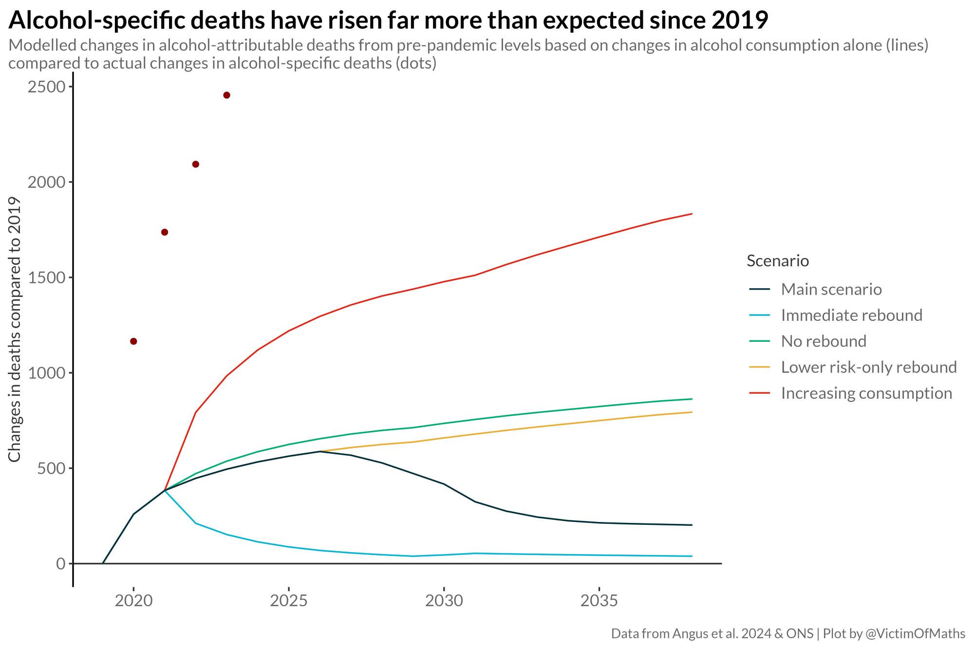
In 2022, NHS England commissioned us to model the potential longer-term trends in alcohol-related deaths based on evidence about changes in alcohol consumption during the pandemic.
We tested 5 scenarios as to how these changes might evolve (the lines). The reality is much worse (the dots).
We tested 5 scenarios as to how these changes might evolve (the lines). The reality is much worse (the dots).
Comments
I'm a bit confused about what years the dots on the chart represent.
but it's the same time series, yes.
The y-axis scale is the change in deaths since 2019.
https://doi.org/10.1093/pubmed/fdae010
Although overall population alcohol consumption appears to have fallen since 2020, there is some evidence that this isn't true for older adults...