ThreadSky
About ThreadSky
Log In
b-moore.bsky.social
•
6 days ago
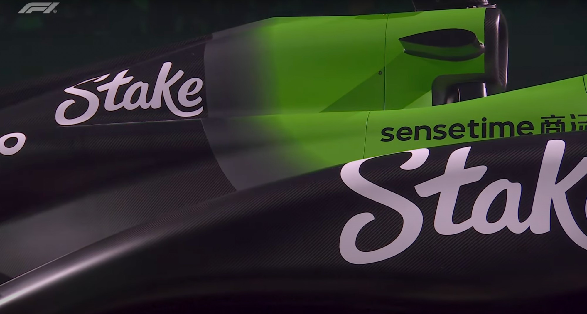
F1 needs to allocate a certain amount of weight for paint. this looks shit
Comments
Log in
with your Bluesky account to leave a comment
[–]
benjaminclegg.bsky.social
•
6 days ago
1/4 of the car has paint, weird isn’t it?
1
reply
[–]
themikebaldwin.com
•
6 days ago
They still paint those cars? Figured everyone was using vinyl wraps.
0
1
reply
[–]
b-moore.bsky.social
•
6 days ago
yea vinyl, which is why that gradient looks so bad. if they did it with paint they could fade it out real nice
1
1
reply
[–]
themikebaldwin.com
•
6 days ago
Ohh okay I see what you're saying!
1
reply
[–]
b-moore.bsky.social
•
6 days ago
another gradient, but blending 2 blues works better here. the Gulf crew helmets are a fantastic touch
0
1
reply
[–]
b-moore.bsky.social
•
6 days ago
the white RB livery. love it.
1
1
reply
[–]
b-moore.bsky.social
•
6 days ago
subtle improvements from last year. more interesting shapes. i dig it
1
1
reply
[–]
b-moore.bsky.social
•
6 days ago
i felt Alpine had the best livery last year because of the subtle use of pink and blue against black. guess they thought different.
0
2
reply
[–]
b-moore.bsky.social
•
6 days ago
another subtle change but its a super sharp look. all logos are well placed and proportioned. little hit of silver works well. this is my favorite so far
1
2
reply
[–]
franckj.com
•
6 days ago
Pretty elegant
1
reply
[–]
b-moore.bsky.social
•
6 days ago
i like this look so glad to see Merc carry on the theme from 2024. gradients look better here than other cars. a touch more silver was a good move too
0
1
reply
[–]
lylae.bsky.social
•
6 days ago
BWT went through a rebrand late last year with the actual company logo being pink so they're capitalising on that
1
reply
Posting Rules
Be respectful to others
No spam or self-promotion
Stay on topic
Follow Bluesky's terms of service
×
Reply
Post Reply
Comments