
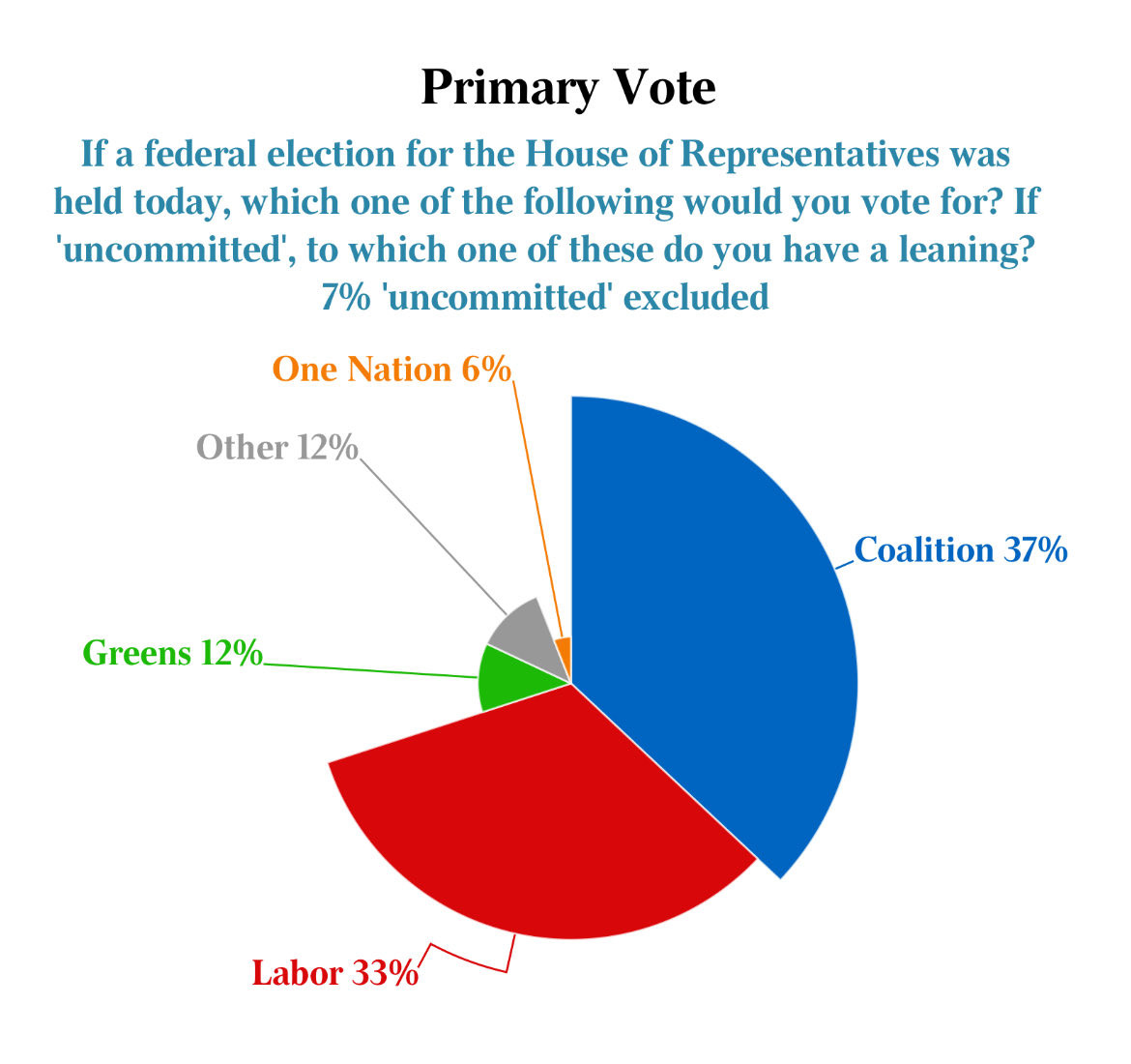
Why is The Australian so bad at charts? This is dreadful. It takes the worst part of a pie chart (comparing area rather than length) and makes it *even worse*. Does the grey slice look twice as large as the orange slice? Does the blue slice look three times as large as the grey? #chartcrime
Comments
Absolutely nuts.
No one should believe anything else this person ever says
They aren't “bad at charts”. They are aware that this chart is misleading. That's why they made it.
Incompetence is not the problem here. Malevolence is.