I love this one, I also highly recommend a cheap, foldable, desktop easel to prop up your tablet if you use one to save your neck and shoulders. I bought one years ago and have been thankful for it ever since.
this is why im glad firealpaca added an option to switch the transparency to a dark checkered pattern instead, helps reduce eyestrain while keeping up the contrast so i can see well w my poorer vision ^_^
from a fellow krita user: you can set the background color when making a new canvas, or, if you're forgetful like me, just make a new layer below your drawing and fill it in with gray :P
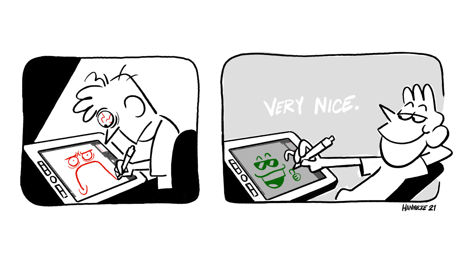
had an art prof tell us that making your canvas gray also makes you lose this weird idea of “dirtying a clean page” and that any eraser marks or missed lines wont look as messy as it would on a “clean” page
No, i've had enough of fucking gray from everything else being goddamn gray now. I am so fucking sick to death of that godawful color i willingly rather blind myself because hey then i never have to see the bleak colorless wasteland making everything gray turned the world into.
i mean you can use other colors too. i use brown a lot. the point is just to pick something easier on the eyes than white (and imo starting with a midtone makes it easier to work with lighter colors in the drawing because you can see them better.)
White never bothered me. But mostly i don't draw on the computer anymore anyways because i found out the skillset translates to the real world and physical mediums waaaaay better than expected. Don't even need the overpriced brands either.
if even a gray plagues your eyes (like me) try a deep beigey brown! also setting your sketch layer to multiply means you never have to think about if your sketching color of choice will show on the background.
That sounds like a good idea. Back in ~2001, our photography teacher was telling similar about studio photography.
Mid-grey walls on the studio space could be either light or dark depending on the amount of studio lights. Grey background puts more focus towards the use of lights, improving quality.
Been doing it that way for years. Always liked the less bright canvas, especially when drawing at night. Also makes it easier to see spots you missed when coloring with brighter colors.
Sometimes I use a grey canvas in most of my drawings but I just permanently set the brightness level of my laptop to 0. And my eyes are so used to it cause if I turn up the brightness up by a smidge it's like getting flash-banged.
People who never worked with materials made for printing may not be aware of that but industry standard for proofing brightness is between 80 and 120 cd/m². It's MUCH darker than what consumer displays come preconfigured to. It's around 30% brightness for my ASUS OLED display. Don't hurt eyes.
my canvases are like two distinct colors, black for sketches (i draw with white on black) and grey for when i color. i do want to start making the canvas colors like a greyed out accent color though so that it's not always just grey. makes it more interesting imo
I've always gone with this, but I've been kinda considering using a 50% gray for a bit. Only issue I run into is that I'd need to find a color that contrasts against it as well as red does on this.
I use a blue-grey shade so my grayscale tones don't get lost in the background when I add those to my pages. Plus if I'm doing a color page it helps with spotting areas I haven't colored in yet.
I still remember when I first started to set a low-saturation temporary canvas color instead of pure white and how much better my eyes felt after. It makes me wonder how I used to tolerate not setting it before, and it's very quick to do.
Comments
like a cardboard brownish beige
I had artist I began fallowing show a lot of cool affects on this toned paper.
I now have everything wither dimmed or set on dark on my socials. The light is just too much
is actually the best idea ever! 😎👍
I also do it
Guilty of the white screen, sorry to my eyes xwx
Mid-grey walls on the studio space could be either light or dark depending on the amount of studio lights. Grey background puts more focus towards the use of lights, improving quality.
https://bsky.app/profile/mrskippyable.bsky.social/post/3lf3ted3wsk2i
My eyes couldn’t endure if I tried it.🥲
I've never once thought about doing this.
Huh.
It changes your life !