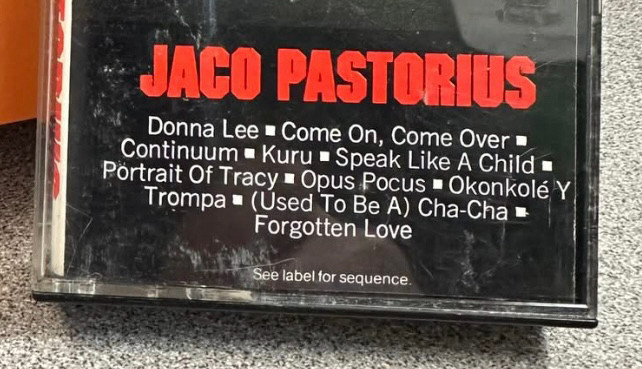
Odd to fetishize such a mainstream thing, maybe, but I always loved the fonts and typesetting on these CBS (Columbia/Epic/Portrait) cassettes. The red block lettering with those 45-degree angles, the squares between song titles. Tempted to cop the look for a release at some point.
Comments