
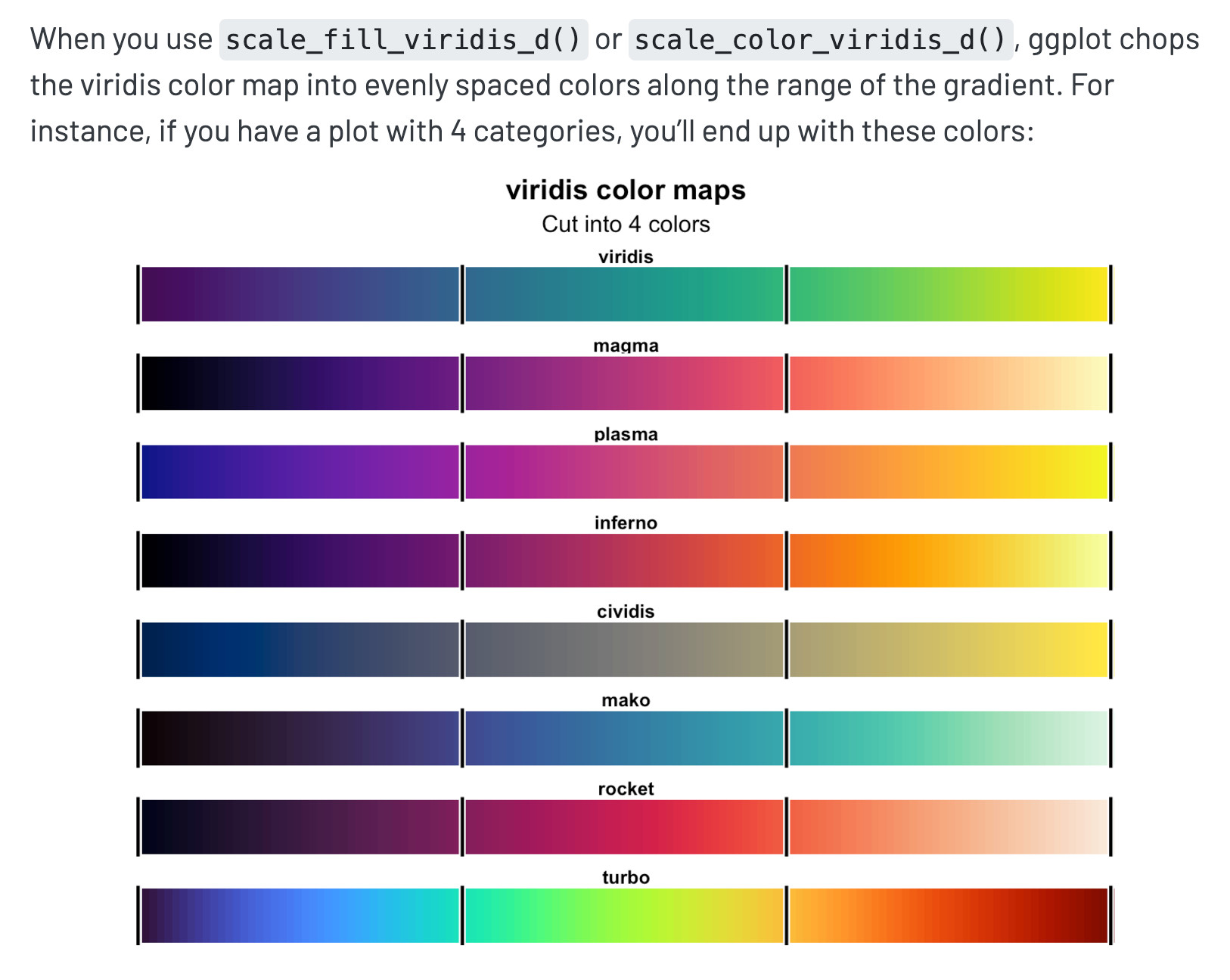
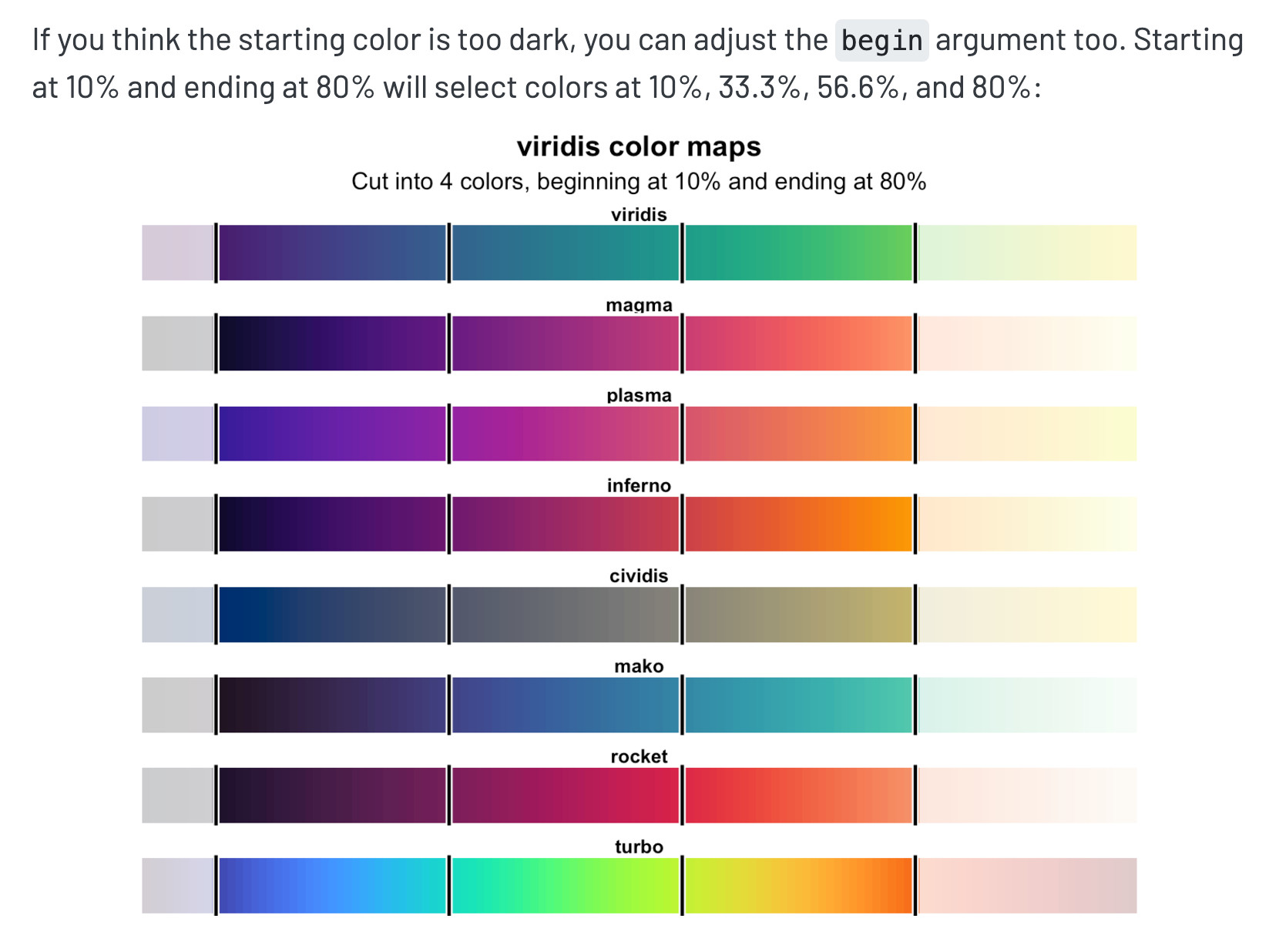
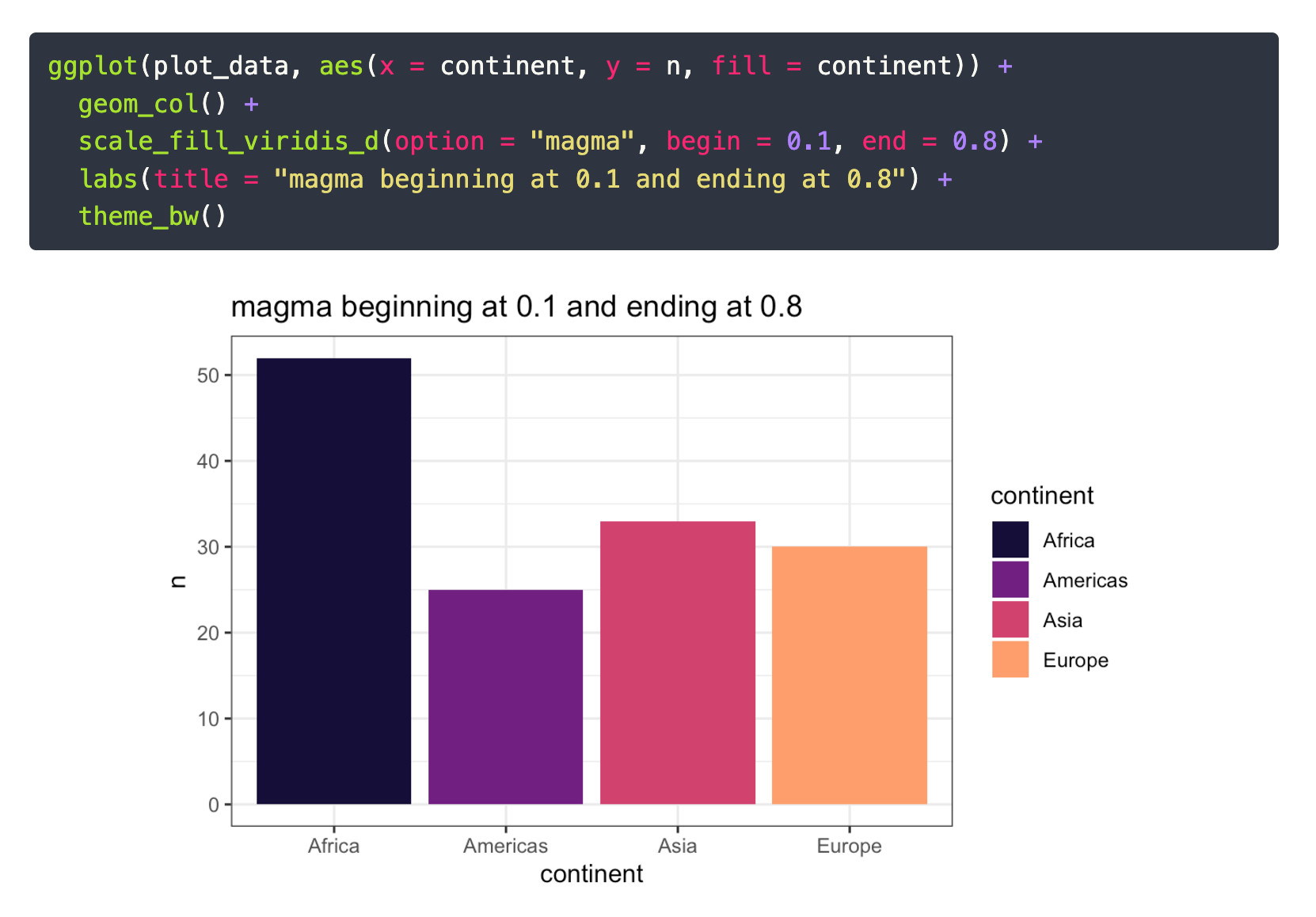
The viridis palettes are great perceptually uniform color maps for #dataviz, but sometimes at the extremes they're too pale/dark. With ggplot and #rstats, though, you can truncate the palette to avoid the paler colors. I wrote a little guide for how https://datavizf24.classes.andrewheiss.com/news/2024-12-03_faqs_weeks-13-14.html#sometimes-the-colors-in-the-viridis-palettes-are-too-dark-neon-pale-or-lightcan-i-adjust-those
1 / 4

Comments