Is this a build that's actually runnable? I think I've tried pretty much every DOS & Windows version going at one point of another, including Neptune, but I've never seen this one before. I even had a couple of early Vista builds at one point, but it never looked like this.
Would be cool if they added actual themes to BlueSky, but it would probably take a lot of code to implement. On the plus side, they could make it a community-driven feature so that they don't have to individually make each theme.
You can use their API to get post information and then style everything your own way with CSS. It’s time consuming, but I’m working on a dashboard doing exactly that
That's basically the idea, MySpace was a very good social media that unfortunately was way ahead of its time and was driven by poor financial choices. I'm sure that BlueSky's got some potential in this factor, though.
The first coding I ever did was on my Myspace page, I actually waa really confused when Facebook took off. I think Bluesky has a ton of potential with supporting Aframe/WebXR. What do you think?
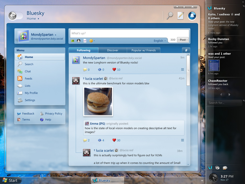
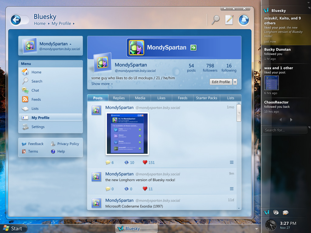
I completely agree with the potential, not only for custom user pages or themes, but also third party clients, in fact some custom desktop applications such as DarkSky or Beeskie are being developed rapidly and early builds are already available for download. BlueSky is what Twitter should've been
I miss UI like this as well as more “physical” tech with buttons, switches, sliders, etc. it’s been a race to “Millenial Gray” for interfaces in the last ten years, especially in cars!
XP always felt a little bit “fisher price” to me - all chunky and colourful. I really liked Windows 95-2000 (XP’s classic theme was ok, but not as good) though
It could just be that everyone is nostalgic for the UI from their formative years.
I grew up with Windows 98 but I always made it colorful. Some dark green at least. Windows XP's theme could seem a bit childish, but I still liked that more than the 90s more "business" style. 7 probably has the best look of all Windows versions, alongside Longhorn!
I think that if anything, people will get nostalgia out of the first iPhone icons and stuff. You know, when the YouTube icon looked like that tv thing instead of the red button?
Good point, my memory is a bit tainted by the blue/plastic. Silver with the green start button blew my teenage mind, though I did eventually switch back to the classic look (and then to Blackbox on Debian when I was more into coding than games)
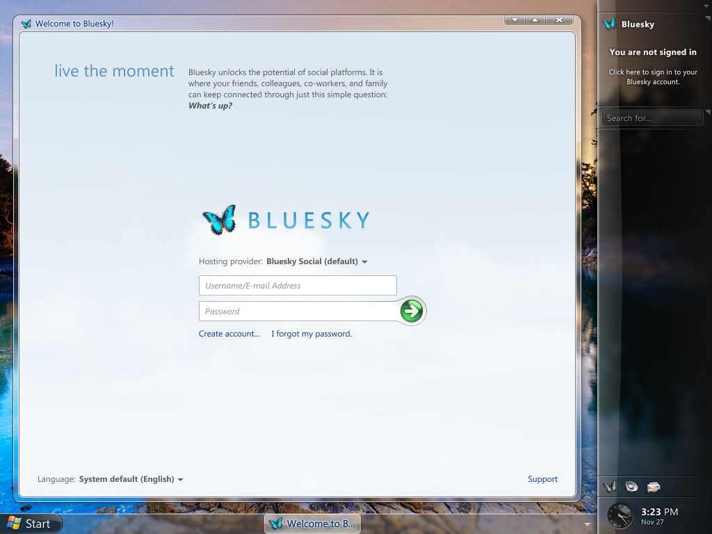
My favorite thing about this is that the buttons are shiny and 3-dimensional looking. I love the cloudy sky in the background of the app as well, a dynamic wallpaper for the app would be sick as fuck. Like during the day it’s blue with clouds and at night it’s dark with stars 🥹
Sadly, just when an average computer can start to mostly handle all the fancy animations and effects featured in those concepts, we’ve already long moved from that era.
Y2k and Frutiger Aero really were some peak design aesthetics, I remember trying to find all these themes for XP to get it to look more futuristic, then Aero with Vista and w7 blew me (and my old Dell laptop's integrated graphics chip) away. I'd love to have an OS with that style again.
As someone who was working as a graphic designer at the time: Yes. We absolutely thought this was corporate and outdated. Many felt since the 90s there had been an oversaturation of gradients, drop shadows and gloss on everything, and the hip thing to do was minimize like in the 70s.

Comments
honestly i would 100% build a dedicated machine for posting like this if it existed.
#bringbackfrutigeraero
Let me know if you have any feedback!
It could just be that everyone is nostalgic for the UI from their formative years.
I thought these trends were cyclical, I was hoping designers would get bored and we’d start seeing chonky 3D UI elements and skeuomorphism again
@skittr.onrender.com
We MUST go back
I wonder if Gen Alpha is gonna grow up looking back at corporate art fondly and think it's just "abstractcore" aesthestics