
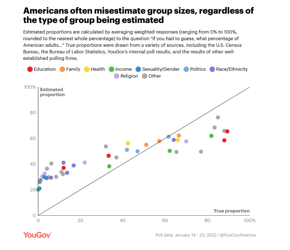
The graph going around showing that people overestimate the proportion of people in minority groups? It doesn't mean much. If you look at the original source you will see that this is nothing except the usual pattern that *every* probability elicitation curve shows. https://today.yougov.com/politics/articles/41556-americans-misestimate-small-subgroups-population
Comments
I look forward to seeing your other posts. Like your generative art!
https://bsky.app/profile/theguardian.com/post/3lbquxljq232w
In people's defense, I still have to read this paper again and again whenever I see this making the rounds.
https://link.springer.com/article/10.3758/s13423-017-1360-2
The results tend to be similar, with people wanting to increase NASA's funding... while already thinking it gets ~20x more funding than it actually gets!