
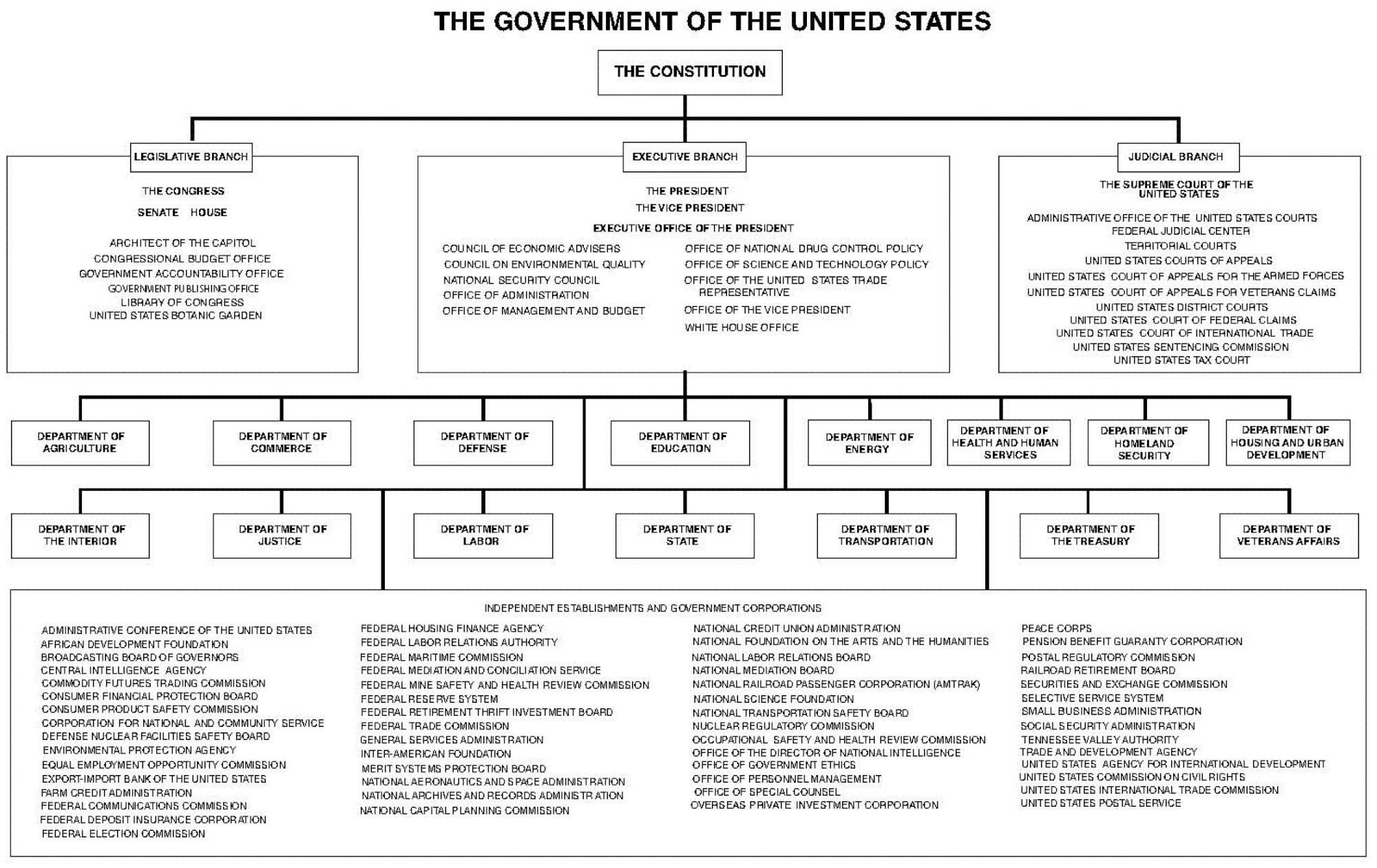
I wonder if we could make a sort of interactive version of the U.S. Government org chart like this, showing which parts are being burned down in which ways every day. Something visual to explain it to normal people who aren't paying attention, translating it to impacts on their daily lives.
Comments
SHRUG
We need different: remove all the money from all the financial institutions.
Senator Murphy gave it a great shot!
It's one thing if the lawmakers say they don't want something. It's a completely other thing if the executive just throws dynamite around
The people that need to understand this the most have the memory of a goldfish and the attention span of a caffeinated toddler.
cc @thomasfuchs.at
Interactive, you can see what areas like health, education, transportation, etc the fed government impacts your daily life, and simultaneously what trump and musk are tearing apart…and how much richer a billionaire gets because of it…love this
https://www.project2025.observer/
People could print it and hand it out
@nancyworld.bsky.social
DM me if you want more help!!!
That’s an awesome idea! We will make it so.
If the @nytimes or @sfchron had any balls, they’d do it, but they’ve told me they’re playing it ‘safe.’ Direct quote.
Show how the cancer is killing the patient, so to speak.
Hmm. Going to get my Figma crayons out…