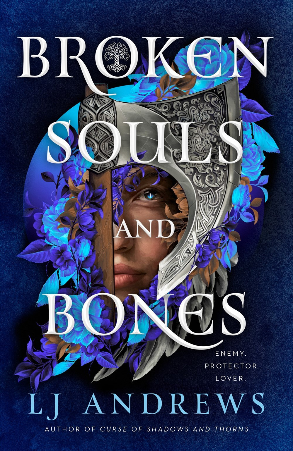
I want to Coco Chanel this cover. (Before you leave the house, look in the mirror and take off one thing.) I mostly like it, but if one thing went away, it would be so much better. Maybe the weapon? #collectiondevelopment https://amzn.to/4ha1iUc
Comments
Log in with your Bluesky account to leave a comment
I like the axe, but I would love to see it without the moon (or whatever that circle is). It might be providing balance, it might also just be too much light blue.
Did you read the book ? The cover might seem more appropriate after reading it ? I hear you though. I totally am a believer in CoCo isms. She was spot on, as well as Philip Johnson, Less is More.
I found this link. I want to thank you for posting your question. You got me thinking and exploring. I am a designer. I have been thinking of a new project, thank you very much !!!
The handle of the weapon screams vertical. Its strong outline (the black line on the right side) draws the eye. Perhaps if the handle outline was softened and angle of the weapon handle ran slightly diagonal? With the subject still looking through the "keyhole" negative space of the blade?

Comments
https://www.printmag.com/book-covers/the-50-best-book-covers-of-2021/