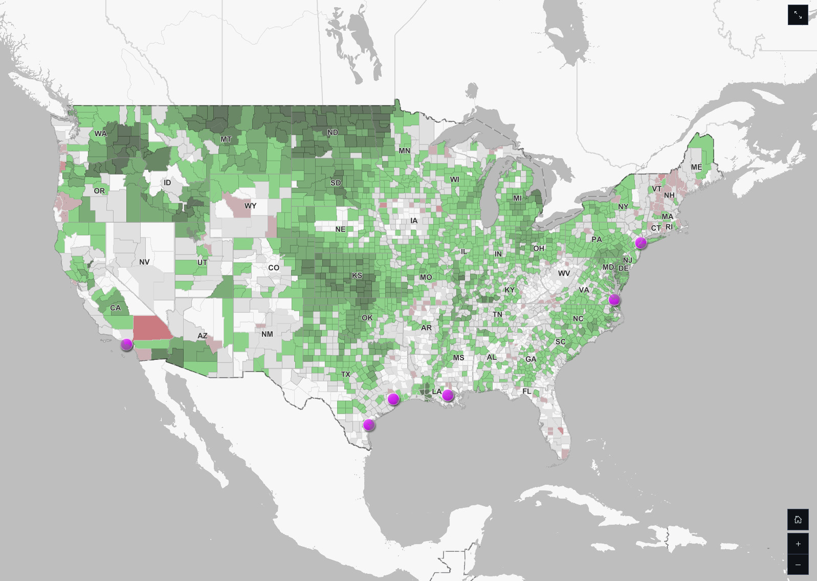
Not my map (a product of https://thedemlabs.org) but a quick dive into their sources looks like (again, my interpretation so take with a large dash of salt) some combination of baseline data about rice/wheat/dairy production and state reporting on shutdowns. Port data seems more likely to be based on actual
But it is also totally possible that the map authors are extrapolating a general shock across all producers rather than identifying specific contracts between farms and USAID--which is then less informative about local dynamics but a reasonable assumption given existing data
the maps look like a standard county-level production data, and we probably need more info on how much is going to USAID. Some for certain, but who knows the correlation?
Ag is complicated and it would benefit us all if people purporting to make informative data viz's were working with those who understand this better. It's not the same as pulling down county level voter data - there are many forces and factors at play.

Comments
https://www.youtube.com/watch?v=b2AAr4p18zk&t=8s
But it is also totally possible that the map authors are extrapolating a general shock across all producers rather than identifying specific contracts between farms and USAID--which is then less informative about local dynamics but a reasonable assumption given existing data