
Goodnight friends, we’re off to bed.
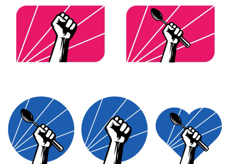
We worked on logos today. What do you think? Which do you like best? The spoon became a symbol of fed resistance when the fork emails came out (see linked story). But maybe spoon is too niche?
https://techcrunch.com/2025/02/06/government-agency-removes-spoon-emoji-from-work-platform-amid-protests/
We worked on logos today. What do you think? Which do you like best? The spoon became a symbol of fed resistance when the fork emails came out (see linked story). But maybe spoon is too niche?
https://techcrunch.com/2025/02/06/government-agency-removes-spoon-emoji-from-work-platform-amid-protests/
Comments
Actually, red might be good if you are a Les Miserables fan. 😉
I can see an additonal connection there
ALT
RESIST
(or resists)
Use purple.
Maybe a syringe in the fist.
We’ll pivot to “Eat the Rich” soon enough.
Maybe we also make one of the background rays yellow for solidarity?
Meanwhile, RFKjr continues to destroy...
https://www.nytimes.com/2025/03/07/health/vaccines-autism-cdc-rfk-jr.html
They're all great!
Alternative : a syringe 😂
(…vaccination is in trouble)
Try one with green too.
Red and blue have been hijacked by our politics.
I don't entirely get the intended meaning of the spoon but other comments have pointed out several ways it resonates with them and I like it overall
Even with people who understand, i think it feels unserious and “custom ping pong paddle”. In this moment, we cannot afford performative resistance, we need to be serious about taking real action and send that message.
https://www.verywellhealth.com/what-is-spoon-theory-6822953
Is the color scheme significant?
I like how it's a left hand (a minority group).
If for wider market, empty fist in the CDC logo.
Me, imma stick with this though.
But, if it's alt-CDC wanting to try to find a logo for the wider resistance movement, then leave the spoon off.
Maybe a raised fist holding up the Constitution, with “We the People” prominently displayed? A beam of light illuminating it as the guiding force behind the resistance?
As someone who had a few swats on the behind with a wooden spoon in my youth, I can attest that it depends on the power behind it. It can be a weapon or an instrument of caregiving by delivering nourishment.
🥄 is his battlecry.
I like your current red logo with text. Clear, strong, nice choice of serif font to suggest stable tradition in print media and long-standing truth and knowledge.
Suggest fist alternative logo have knuckle tattoo. Pointer alt.
I like both spoon and spoon-free images; however, I stared at it for quite a while when you first posted the blue image with spoon a few days ago: I have no idea what this is referencing.
So, I left with: Cool! Wonder what that was about?
And then I kept scrolling.
I never claimed to be diplomatic.
Find what Thor had big Sledge hammer
I like just the spoon in hand
no other fluff
What feels most true to you?
Yes people use the spoon for chronic illness. I read it as a strength too. Even with this last spoon, I resist.
Just thoughts and a reframe from a therapist.
Also, I’d reevaluate the proportions of fist vs background. It’s looking a little small.
Maybe a spork? After that one Trump parody about the department of education.
I think color is good. If you want to try others, maybe orange? Idk why I'm thinking it might be good. Energetic.
The spoon and hand work with the heart shape as it has better proportion. But that should only be an alternative logo for tee shirts.
The altCDC word branding is better. The fist alone has no assn with CDC. And diag is fox