it wont. for a large number of avarieties and conditions and parameters that you'd scarely be able to wrap your brain around, even when you have two braincells to rub together. Its like we're all immortal single celled jellyfish that fart all day in the ocean. Jellyfish farts are something. :)
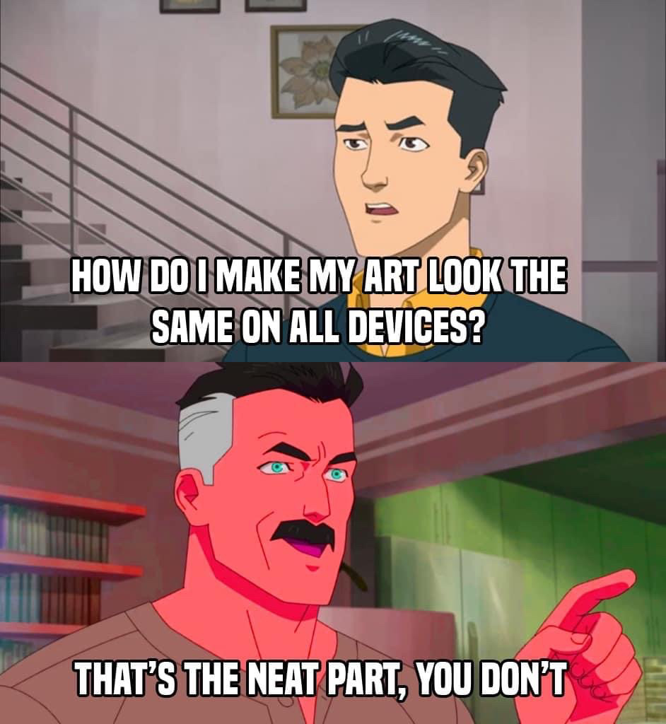
Man, we really need some wide-spread color standards across devices. I have two different monitors, which display the same colors very differently, and moving windows between screens gives me whiplash/dissonance (word choice?). How has this not been done yet?
I color calibrated my screen using an expensive spectrometer so that it can still look different on every other screen, whether they're calibrated or not.
Literally how I felt uploading Ibis art from my phone and wondering what was wrong with it on pc until I saw my monitor settings were on warm colors... 💀
My new digital art device has this problem... It's desaturating all my colors. It's like I'm using only pastel colors. I had to try and color correct the display, and it's only slightly better now.
This is the most frustrating part about art. I make my stuff look as best as it can on my monitor, only for it to look underexposed and dark on my phone.
Oh I love surprises. It makes it so I can problem solve and maybe find something new I can do. I use free programs so consistency isn't something I give two shifts about.
The amount of times I beg fellow artists to please use their screens's sRGB mode. Yes the factory calibration may not be great, and it will drift if the monitor's old. But it's better than having the screen be *even more wrong*.
None of this applies if you own a colourometer, obviously.
So true. Even when calibrating screens, it's going to look different because of the environment it's in, and then someone's going to look at it on a different screen and it will look completely different anyways.
my surface makes eveyrhting brighter and warmer than any other device i own, its such a pain in the ass. i have a handful of things ive been considering streaming to my main monitor to edit since its closest to how a) others will see it, and b) how itll print.
This probably explains why I almost never digitally draw in color, because no amount of tutorials can help me when my screens can never agree whether a color is peach or red.
Fighting with a cintiq for literally hours to try and calibrate the colors only to realize there is no winning, it is uncalibrateable to match my 4K monitor, it physically cannot be done, the red channel is irreconcilably fucked
Nerd: "Yes but cmyk and colour theory". Fuckoff colour is a vibes-based struggle that cannot ever be complete. I will splash the canvas with whatever delights me.
Every device is gonna have different quality screens with different brightness and contrast scales and different math for displaying images. Trying to make the *file* look the same is like trying to be a gold medalist in every sport at the same time.
i mean... you work on a calibrated monitor... and hope everyone else's are reasonably close. Nobody tell OP about the hell that is prepping things for print.
Colour management and display calibration helps a lot, but even that can't fix:
* Going outside
* Staying inside
* The sun coming out
* Being around coloured objects
Best you can do is get a swatch of colors IRL and then load the same colors up on the screens, then calibrate the screen display to match as best you can
I ran smack dab into this problem the last time I streamed some character designing from my iPad to my Discord for friends to watch, using an HDMI capture card from iPad to PC.
It looked so horrible and washed out on the stream. 😭
Wait, can you not stream from an iPad? My little Galaxy and even my phone has streamer modes. I've never tried them, but I just assumed Apple would have parity.
So much effort can be put into color spaces and color accurate workflow, yet there no way to make sure people who see what you make have anything close to a color calibrated display.
I'm old enough that a graphic artist in the video game industry told me "NTSC" means "Never Twice Same Color", because back then, you wrote games for cathode-ray tube televisions.
I work on my iPad in CSP and I feel this. I usually slap a few correction filters on and toggle them (if I remember to) I crank up the luminosity / brightness to see if it looks bad that way XD
I work on a Wacom hooked up to a laptop, and I usually download stuff on my phone to check (because how would you notice mistakes if you don’t stare at your work all the time) and let’s just say each screen has been registering a completely different set of blues for the last week 🤦♂️
Flashbacks to art school where my phone screen was different, my laptop screen was different, the computers in the library were different, the computers in each DA lab were different, the projector screens were all different, AND the Cintiq screens were different.
I just seen a video that finally explains green waterdamaged dragonball releases as a failure to colorshift white-balance to different values depending on theatrical vs home releases
My current desktop setup has one Dell monitor from 2009 and one Acer monitor from 2015. I have calibrated them as accurately as is humanly possible and yet all I need to do is to pass my art from one screen to the other to be reminded of this problem.
Years back I once saw my photos on someone elses pc and from that moment forward I stopped taking photos and putting them on line because - f**king hell it was bad.
And even after quietly playing with the settings, that colour wash was never going away. (This was pre-lcd...
and even then early lcd's ranged between crap, to bloody awful, to meh). Now, years later, I could probably trust that most mid-range monitors give a reasonable rendition if the settings are not screwed with or set to some odd "gaming" default; but my enjoyment was that day, sadly forever ruined.
At the minimum, artists should be explicitly tagging the colour space their artwork is in with a colour profile. sRGB is the standard, but Display P3 and DCI-P3 is fast becoming more common as well (the former is essentially now standard on Apple devices).
I have a monitor that is capable of sRGB, DCI-P3, and Display P3; I set it to use Display P3 since I also have an iPhone (which uses Display P3) and I need to be able to see photos I have taken on my iPhone on my computer with no loss of colour fidelity.
I usually have my art program (Affinity Photo and Designer, in my case) set to tag images with sRGB tho if it’s something that’s not coming from, or going to my iPhone.
I got a new tablet to draw on recently and specifically oranges are a nightmare. It’ll look lovely on the tablet then anywhere else it’s the most saturated orange in the world and it’s so annoying! If it was tiny difference I wouldn’t be bothered but it’s not. 😭
i spent a decade of my music making journey stressing about sounding good on all kinds of listening devices. now i've settled on simply excluding people from my art.
my music is for speaker towers and large sound systems. i won't mix for bluetooth or phone speakers. made my life so much easier.
Oh boy, I love the subjective perception of differences in wavelength in the context of retinal image projection
I especially love when the wavelengths are projected differently from different surfaces
With printing, a little trick I learned was to take the piece, duplicate the layer, set that layer to screen, and drop the opacity of it down to about 30% ish.
ofc some colors are just fucked because CMYK, but it gets to pretty close to the screen for me.
Oh god I remember my student days one of the first things we learned about digital is how different programs and computers can change your pieces appearance. Tbh I didn't really enjoy digital work but that was also due to using adobe🤮
Had an old CRT monitor that I didn't realize was super dark at the time, half the time I colored anyone with what I thought was brown hair, they ended up orange when shown on anything with decent lighting.
I saw an example of this earlier: a photo of trump and a big screen showing a live feed of himself; the colour on the screen looks natural but trump is a sickly green-orange standing in front of it.
a calibrated display might appear to be too yellow or green, but it's actually a lot more accurate!
I had to fix my tablet recently because it legit looked like the bottom one while my other screen looked like the top. checked my phone to make sure which one was closer to reality and dropped the red saturation by a whole 20%. my pictures look normal now lol.
Shout out to the times I've drawn things on my screen tablet and it looks like things are completely in shadow, but then i look at it on my phone or another screen and you can see a bunch of the mistakes/unfinished edges in the dark areas that should have been hidden 🫠
Comments
Aka, "grabbing a handful of mercury"
Magic.
Why is all of your work so dark? 🫠
None of this applies if you own a colourometer, obviously.
Anyway: I started opening a separate window on another monitor when I do colored pictures. I use an XPPen and it's always red shifted.
When I work on my XPPen, I keep the navigator up on my best monitor to check in real- time, too.
It's not even an XPPen problem- I've used Wacom's options, and they still have the same issues.
I've had images that look great on my phone, but when I look at them on my PC, it makes me question how great they really are lmao
It’s the damn devices 🤦♂️🤦♂️🤦♂️
calibration can help, but monitors vary in capability.
https://en.wikipedia.org/wiki/DCI-P3#/media/File:CIE1931xy_gamut_comparison_of_sRGB_P3_Rec2020.svg
😬
* Going outside
* Staying inside
* The sun coming out
* Being around coloured objects
She had 20 years experience. Un fucking real
I love her very much but it was amazing to me she was able to produce lovely art with that limitation.
I ran smack dab into this problem the last time I streamed some character designing from my iPad to my Discord for friends to watch, using an HDMI capture card from iPad to PC.
It looked so horrible and washed out on the stream. 😭
So I said fuck it, this is my cue to transition from iOS-only ProCreate to Krita and I got a secondhand Huion tablet to go with it.
Chaos. (But also Part of life.)
I had no idea about such jobs before
I've spent like 4 years trying to get the pictures on the two screens to look the same.
And even after quietly playing with the settings, that colour wash was never going away. (This was pre-lcd...
I just aim for something that looks decent on my various displays, because who knows what my client is viewing things on.
... I've had people forget to turn off the blue light filter on their phones before giving feedback. :|
my music is for speaker towers and large sound systems. i won't mix for bluetooth or phone speakers. made my life so much easier.
I especially love when the wavelengths are projected differently from different surfaces
Color was a mistake
ofc some colors are just fucked because CMYK, but it gets to pretty close to the screen for me.
a calibrated display might appear to be too yellow or green, but it's actually a lot more accurate!
Spend moneh