I’m bothered by the absence of a specific question. “Lost faith” or “not satisfied” WHICH IS IT? Neither one is great polling question but at least tell us what you asked.
The problem is that it makes the downward trend seem a lot more pronounced than it is, perhaps intentionally as when you look at the data there's nothing to report, just a small variation that is within the margin of error.
Great post. Though I do wonder what if the y-axis is "year"? With zero at different times in different religions? And what if the y-axis is temperature? With zero at different temperatures in different scales? Perhaps some flexibility is needed.
What questions did they ask and why are young people less satisfied about democracy?
There could me many different reasons of dissatisfaction. Some could be fair.
Not surprised. For NL: failing education and a life long exposure to a tsunami of (digital) advertising.
The different between the oldest generation and younger ones is marked by the use of internet and free market.
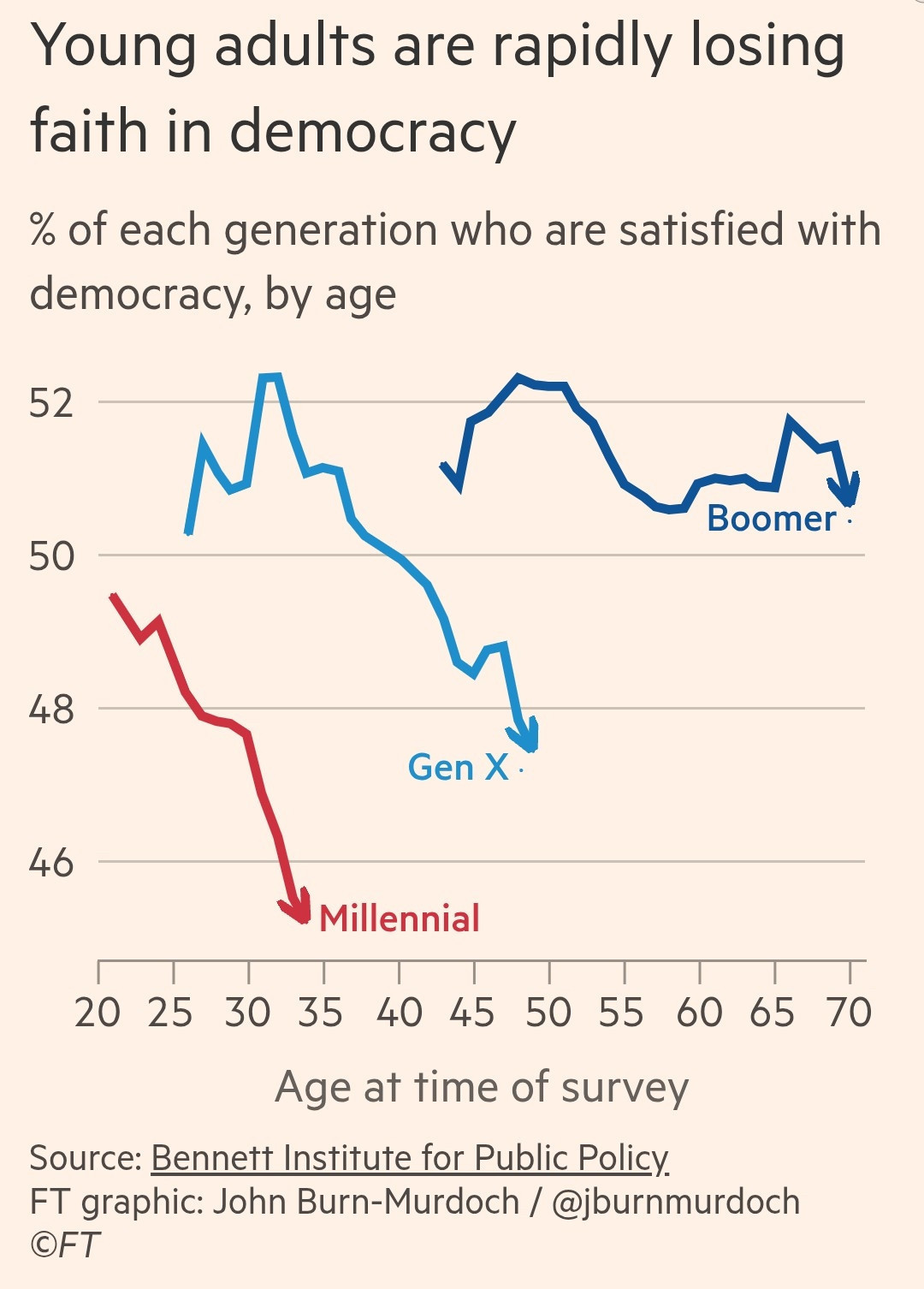
It would been better to be year on the X-Axis, so you could understand what historic events might have guided respnses. The “age at time of survey” would still be relatively interpretable from that.
After much thought which might have been helped by reading the article, I think the author is trying to say, "Look, the succeeding generations have less confidence," which is why they are comparing ages. But it took me quite a while to figure that out. I'd rather see years on the x-axis.
Also I'd argue that what the graph shows is that younger people are more idealistic and radical on average, which I would be highly surprised to learn has not literally - literally - always been true.
That's the point, as far as I see it. The wild swings we see in so many graphs on the news amount to tiny blips when you see the whole range. It would probably lead to more sensible decision making in many areas.
I get the deterioration over time but generations are 15-20 years and the surveys were over an age range of 15, 25 and 35 years respectively. Plus if this was recent they are missing a lot of the older range in each generation.
The earliest survey was taken when boomers were about 45. I’m at the tail end and when I was 45, Millennials were about 10 and there were no Gen Zs. Today, how old is the oldest Gen-Z? Just under 30, so why would there be data past that?
The last surveys must be several years old because they are missing ~8-10 years of age in each generation. 71-78 for boomers, 51-59 for X and 34-43 for Millennials.
Sorry, this is for GenX and Millennials. The oldest Millennials are still in their 30s. The oldest GenX are in their 40s, maybe nearing 50 but I doubt it. The older ages are missing because they don’t exist yet.
can't speak for everyone else, but it's knowing actions bordering on(if not perfectly described by) kleptocracy are happening i have issue with https://en.wikipedia.org/wiki/Kleptocracy
Like, this happens to be the case where zooming in too far makes what is probably mostly noise look like a catastrophic trend, but yeah, you can do the opposite where you hide significant changes by demanding they look large against the origin
And for that case an extension of the x-axis. But then they probably chose the age range and were't interested in really old boomers like me.
Date of survey?
Question(s) asked? Really important.
Sample population?
This would hae been chucked back at me with a 'go back and do better'.
This is almost certainly just one screenshot from a long article, which links to the tables and detailed info. John Burn-Murdoch is a conscientious sort.
"Satisfied with democracy" is ambiguous and a bad question. Are they dissatisfied because they want more democracy, or less? "Strong leader who can ignore the legislature" is more revealing.
This chart is kind of dumb, even beyond the truncated y-axis. So, older members of these generations are less satisfied with government. You could swap the x-axis, slap an arrow on the other end of the line and say "younger members of these generations are more satisfied with government!"
Also, I assume that the surveys started at different tine points per generation, so a better (but less compact) graph would have the year of survey administration on the x-axis so we can make inferences about why it it went from bad to worse and for whom.
Also, how tf is "age at time of survey" useful as an X-axis trend line indicator?
I suppose they could be polling the same cohort over and over again, but this graph is baffling as a standalone without explaining what the arrow actually signifies.
Each arrow shows a declining satisfaction within each age group over repeated surveys. The point being made by the chart is the relative steepness of the arrow in younger generations. The younger you are, the faster your dissatisfaction grows.
Learn to read charts. When someone says the chart is clear and it’s not their data, maybe it’s you. Took all of 15 seconds to get the gist of what the chart was saying.
How are there entries for different generations by people who are the same age? Is this a survey of people who think they're boomers vs. people who think they're gen x?
The x axis isn't the data of the survey, but the (average?) age of the cohort at time of survey, so it's like all the lines have been shifted to highlight age rather than time.
Each arrow point shows the latest data (2024?), but they're each 15-20 years apart (because they're different ages)
I have a bigger problem with the X axis honestly. Without additional information it's showing that as people age within a generation cohort they get less supportive of Democracy... and there are big weird overlapping discontinuities between generations.
The term ‘democracy’ covers a near infinite spectrum of systems that is limited only by our own creativity. The current American system of democracy is a failure, but it can be reimagined and improved drastically. Problem is…the current system heavily favors the rich.
I think it’s more than our democracy they’re losing faith in. It’s our entire governmental system. The young, and many elderly, are seeing known criminals being elected to the status of President of the United States of America.
Oh and by the way, P-Diddy’s up for an office aside Trump.
No, it's fine as a warning, it's suspect to extrapolate a firm trend out (especially far) and hang your hat on it. A single survey, or even a series of surveys alone is usually not robust enough for something like that.
Case in point: there were plenty of forecasts in the recent past that the Dems were on the road to a permanent majority because of "demographic trends." There was a lot of data that seemed to show it. The error was the long-term extrapolation.
I'd say about equally. It's okay to use a truncated axis when you're focusing in on differences, but you miss the big picture here. A 1% difference is not a lot.

Comments
How free rein capitalism destroyed democracy?
I'm more bothered about the arrows which imply a continued downward trend in the future.
Good you're not a dictator, as shown by this graph of climate change:
Thx https://skepticalscience.com/the-y-axis-of-evil.html
There could me many different reasons of dissatisfaction. Some could be fair.
The different between the oldest generation and younger ones is marked by the use of internet and free market.
When it serves their own egoistic interests…
https://en.wikipedia.org/wiki/Kleptocracy
Wilfully misinterpreted data on the other hand...
Date of survey?
Question(s) asked? Really important.
Sample population?
This would hae been chucked back at me with a 'go back and do better'.
Crap like this drives me nuts
😉🙃😉🙃😉
A 4pp fall is also a fair amount, but I agree that it could be misread. But the other side of the issue is that many are bad at reading graphs/tables.
t. a millenial
I suppose they could be polling the same cohort over and over again, but this graph is baffling as a standalone without explaining what the arrow actually signifies.
PDF page 12:
https://www.bennettinstitute.cam.ac.uk/wp-content/uploads/2022/06/Youth_and_Satisfaction_with_Democracy-lite.pdf
They aggregated the results of many surveys - the trend lines indicate how country/age-specific samples behaved over time. More info in alt.
I thought it would be clearer in the FT article, but...nope. Doesn't even mention the data is 4 years old.
Had to go back to the source to understand what the hell it meant.
https://www.ft.com/content/350ba985-bb07-4aa3-aa5e-38eda7c525dd
You wanna argue the data or just argue?
Conversation tip:
Someone says your datavis is unclear, don't expect a warm welcome when you respond with "nuh uh".
Each arrow point shows the latest data (2024?), but they're each 15-20 years apart (because they're different ages)
look at the y axis: it’s only a b small range
Anyone who thinks we still have a functioning representative Republic is either high or delusional.
We are shockingly screwed.
The leaders are attempting to kiss up to the dead rather than look out for the future.
Oh and by the way, P-Diddy’s up for an office aside Trump.