
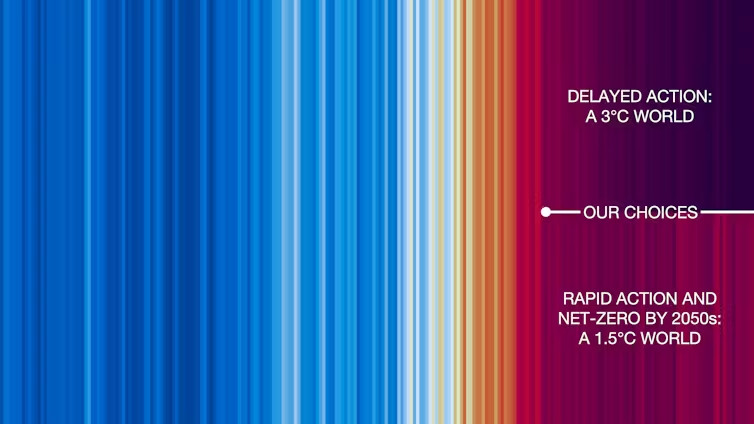
I think this is one of my favourite colourful climate chart type things, because it depicts two things at once:
- Things are going to get worse, no matter what
- The degree to which they get worse depends on decisions made today
https://theconversation.com/my-new-dark-red-climate-stripe-for-2024-shows-its-the-hottest-year-yet-246914 by @edhawkins.org
- Things are going to get worse, no matter what
- The degree to which they get worse depends on decisions made today
https://theconversation.com/my-new-dark-red-climate-stripe-for-2024-shows-its-the-hottest-year-yet-246914 by @edhawkins.org
Comments
The phytoplankton is dying.
I understand the desire to do more, but don't write off what's already been done.
(For real)
Nothing would please me more than to see a TUSO succeed
We don’t need money in politics. We just need people to participate.
https://www.nationalfinancialplan.com
With no action taken, humans as a species will cease to exist.
Now you explained it it is rather cool
‘ Because we have caused these problems, we can also solve them. Our choices determine what happens next’ 🤨
It’s always been up to us … now it’s urgent, very urgent 😳
I feel the word vegan has gotten a bad taste to too many people.
Let's sell it with a smile.
https://theconversation.com/my-new-dark-red-climate-stripe-for-2024-shows-its-the-hottest-year-yet-246914
If we look at history humanity has unfortunately never done what is best for itself before it falls off the cliff.
but we are still all Apes.
Sorry you're not getting your apocalypse and have to, like, take proactive action.
Stop buying new stuff as much as you possibly can, especially fossil fuels like gas.
Seriously. That's all you have to do. I understand it's not easy, I struggle with it myself, but that really is exactly what you asked for.
But 70% of our emissions come from our consumption, so changing our consumption has an immediate and material impact.
Without these shit heads hoarding wealth, we'd basically be post scarcity
Bc, sorry not sorry, no one should have house 4 when ppl are trying to get house 1.
People need to look at what .gov-caused inflation and job killing policies are doing to their lives and not blame so-called wealth hoarders, as if that's some sort of finite, zero-sum game
https://www.frbsf.org/research-and-insights/publications/economic-letter/2023/08/how-far-is-labor-force-participation-from-its-trend/
Ha.
Job killing policies? When at this low unemployment?
Nah.
To you I say ~ What an oligarchist screed.
And while democracy is best,
I do not think an oligarchy is better than communism. Pretty similar in practice.
As far as unemployment that's the headline story but a shrinking labor force and with participants dropping out impacts that number
And I'll assume you conceded your original point about can't find jobs?
But hey, if one bought Trump Coin at the open yesterday then inflation is of no concern 😂
And people have far less access to less immediately violent methods than governments.
The Right is just more susceptible to media manipulation, so they've been better lulled back into compliance.
You don't get to those positions by being a good person... Or giving a shit about ppl. So, fuck 'em
The question is who is willing to take one for the team.
Individualism won't get us anywhere
Well played fossil fuel industry.
That's humans for you.
Until it's an eminent disaster OR there is money to be made, no action.
Vegetarian, never car only bicycle/public transit my whole life. Those were both FOR ME. My esthetic choices in lifestyle. So don't give me "virtue signalling" back talk.
It's basically just white ppl. Marginalized groups in the western world, as well as countless Indigenous communities and ppls, have been fighting against climate change... Right down to chaining themselves to heavy equipment
Decolonize your methods of thought.
It has been a major contributor.
Making it race is moronic.
It is systems and patterns of behavior.
This is the issue.
Whoever does it.
Yes, Europe and its colonies had the pollution tech first, so they got a head start.
https://climate.nasa.gov/vital-signs/sea-level/?intent=121
https://arctic.noaa.gov/report-card/report-card-2023/greenland-ice-sheet-2023/
It's a bs idea (there is no future in space if we don't even manage out future on our home planet), but it's exactly that kind of escapism driving them to the levers of power.
Hope they don't do to much damage before it happens
Also, it is super cool to be able to look at different states and cities in the US, if you haven't seen their viz tool. Phoenix and Tucson are 😳
News today....
tldr everything more expensive
That's good news for every other species that has been suffering at our hands.
The only thing that makes us special...we kill everything we touch.
the last time the earth naturally rapidly changed its temperature dramatically there was a mass extinction event
Humans are the 8th mass extinction event 🤷♀️
also americans have already decided genetically engineered FOODS are bad. and genetically engineering humans is illegal in the US and Europe. you gotta go to china to even consider it
Why?
What's going to stop the US military from being one of if not the biggest polluters on the planet? Nothing is the answer. Nothing short of the US collapsing.
Everyone else would need to pick up the slack.
"Was capitalism worth it?"
The longer we let it roll the longer it takes to stop.
No reversing.
The plans to get there rely on non-exsistant tech and extremely optimistic projections. While many corporations and governments have already backed away from their commitments.
But what it also shows is that if the policymakers take responsibility and care for our descendants, vulnerable peoples and countries, biodiversity etc they can change the future
"Summing up, the end is near and we're all doomed, now on to sports"
- From IPCC's recent AR6 report
- From me scrawling shit on top of another part of IPCC's recent AR6 report
The real problem is a lack of morals and empathy.
Venus is a lot hotter than that.
Pushing the accelerator down (more CO2) means your speed (global temperature) increases faster.
Problem: it takes a long time to slow down.
https://science.nasa.gov/earth/climate-change/greenhouse-gases/the-atmosphere-getting-a-handle-on-carbon-dioxide
Unless I am discovering that I am colorblind right now...