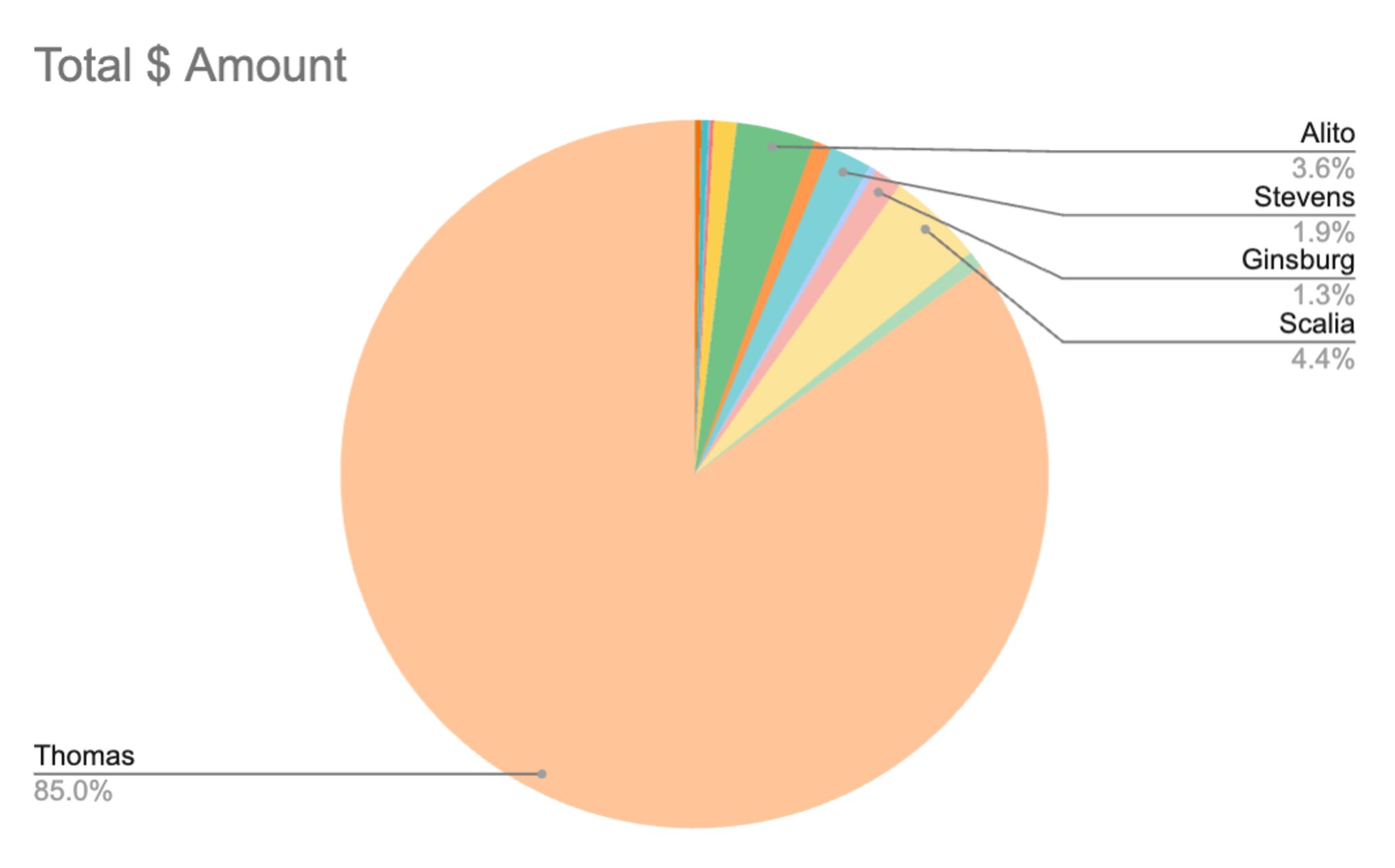
Just a suggestion (I worked in data for yrs), adding 1st names (or initials, if it's a space consideration) + yrs on court would be helpful. I'm no fan of Rehnquist, but > 30 yrs on SCOTUS & <$13k in gifts is commendable & even more damning re Thomas. Kudos!
Of course. I'm just obliquely hinting at the fact that lately, there probably has been at least informal performance reviews of Thomas by his primary sources of of income. Which appear to not be the government of the US.
It only features what's reported, which means it doesn't include Kavanaugh's hundreds of thousands of dollars of mysteriously accrued debt that mysteriously disappeared once he was nominated - and also heaven knows how much *more* in gifts to Thomas.
It's more frequently asserted, and quite plausible, that his rich parents paid.
That leaves the question of how he fell into huge high interest debt. His explanation is bunk, and the debt is consistent with covering up illicit cash transactions. The sort of thing he might be blackmailed over.
Notably it doesn't seem to include this famous case?
I suppose that's because it's hard to say exactly how much Thomas (and his mother) profited from this transaction. But that's obviously intentional and I expect there are many other such cases.
Yeah, even aside from whether Thomas made an extra profit on the sale there's so much in that of benefit to Thomas, that doesn't involve any gifts *to* Thomas: Thomas's mom lives rent-free in a home expensively refurbished by Crow, who also bought neighboring properties and plans a shrine to Thomas.
This keeps coming back around, but we *know* where Kavanaugh's debts went. He got his parents to pay them off for him, and he didn't want to say that directly because it's embarrassing to admit that you're a middle-aged man letting your parents buy you everything.
But:
1) It wasn't reported on this form!
2) We *still* don't know how the debts happened. The official story is obvious nonsense, and it very much looks like Brett was covering up cash transactions that could be embarrassing or discrediting.
There's a full write-up (from a leftwing writer) below, but the short form is that gifts from family don't have to be reported on judicial disclosure forms, Kavanaugh's family is extremely rich, and he has basically admitted it, he just won't say it directly.
I'm not sure what you mean by "reported," but according to the article they included gifts that were identified by Fix The Court but not reported by the justices.
It's great that they're including information reporters managed to dig up about big-dollar gifts that were never reported, but that does rather raise the question of how many more unreported gifts were never discovered, likely involving those same justices we know like to receive and not report.
No, because there is no $$ amount going to Thomas. I guess, his mother is a separate case, but of course, it is a major benefit to Thomas nevertheless! 🤬
People don't generally begrudge an elected official from receiving, like, an engraved watch or whatever at a banquet. Even the gift of an airplane ride to a special event might be normalized by most people.
RVs, private school tuition, and spa weekends are like gameshow prize level tho.

Comments
Still didn't report a lot of gifts, but the denominator isn't 30 years.
https://newrepublic.com/post/179119/john-oliver-clarence-thomas-payout-resign-supreme-court
But Thomas is just astronomical!
I'm ignorant of the way this works but I would like to think that amount should be at or near $0 per lifetime appointment.
@meidastouch.bsky.social
@marcelias.bsky.social
@joycewhitevance.bsky.social
the MAGAs are turning the US justice system against the country.
That is hyper-alarming.
https://bsky.app/profile/chadstanton.bsky.social/post/3kubupkaaur2z
would very much like to see where kavanaugh weighs in currently
That leaves the question of how he fell into huge high interest debt. His explanation is bunk, and the debt is consistent with covering up illicit cash transactions. The sort of thing he might be blackmailed over.
I suppose that's because it's hard to say exactly how much Thomas (and his mother) profited from this transaction. But that's obviously intentional and I expect there are many other such cases.
But:
1) It wasn't reported on this form!
2) We *still* don't know how the debts happened. The official story is obvious nonsense, and it very much looks like Brett was covering up cash transactions that could be embarrassing or discrediting.
https://www.motherjones.com/politics/2021/09/heres-the-truth-about-brett-kavanaughs-finances/
https://fixthecourt.com/2024/06/a-staggering-tally-supreme-court-justices-accepted-hundreds-of-gifts-worth-millions-of-dollars/
But it is pretty stunning.
https://www.businessinsider.com/clarence-thomas-billionaire-bought-moms-house-terrible-neighborhood-2023-8
She is not under scrutiny, & it goes to the same place.
RVs, private school tuition, and spa weekends are like gameshow prize level tho.