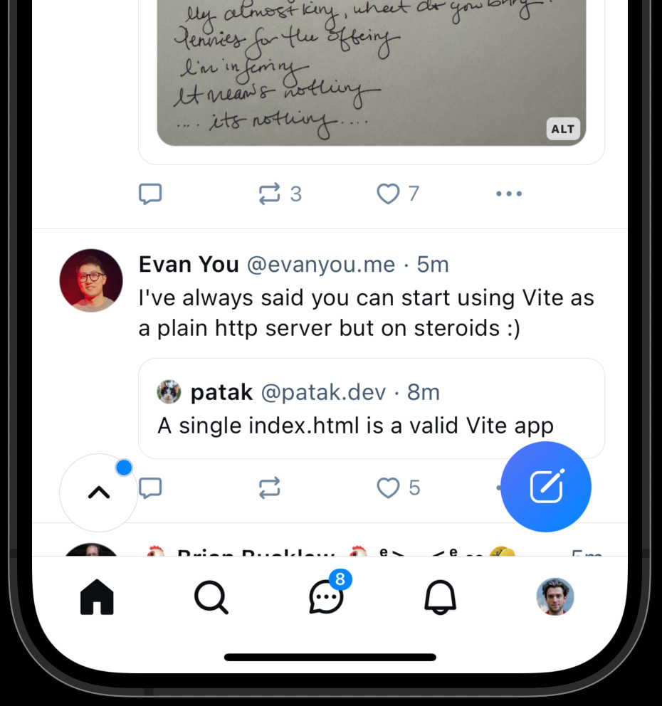
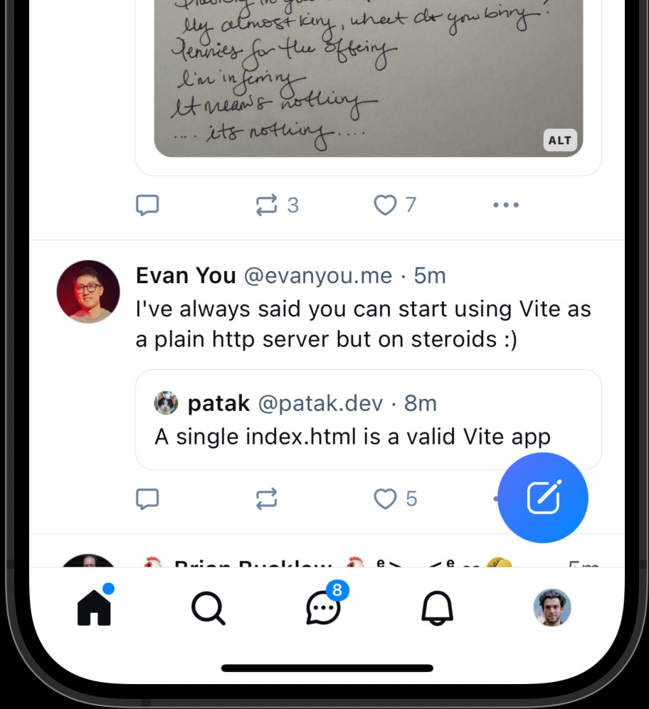
do you have any preference between these two placements?
on the left picture, the "new stuff" badge is in a “scroll to top” button; on the right picture, it is inside the home tab bar button
any particular reason why you prefer either of these?
on the left picture, the "new stuff" badge is in a “scroll to top” button; on the right picture, it is inside the home tab bar button
any particular reason why you prefer either of these?
1 / 2


Comments
for folks who *do* prefer the left one (or who actively use the floating button in other layouts like on desktop or tablet) — what do you prefer about it over navbar?
what other apps do you like using that have a similar floating “scroll to top” button?
I was thinking about taking a crack at implementing something for this but if it’s already in progress I won’t spend the time on it.
- the "go up" button is under my thumb in lots of views. indicator is a cue that more is available, but it's totally my decision when/whether to do so
- task bar buttons let me move "sideways" between views
If so, why would it be at the bottom (where you're going away from), instead of the top, (where you go to)?
Tap behaviors on the tab bar are modal, but in a more coherent way, because both modes mean "go there"
If you're on another tab, it switches you to that tab (broad "there")
If you're already on the tab, it takes you to the top of that tab (narrow "there")
button = you're not at the top of this view, but can go there
indicator = there's new intent at the top of this view which you can see if you tap
This is coherent, works in all views + is more discoverable ("what does that do?")
(stupid autocorrect)
The Home button scrolling to top has screwed me over multiple times when I was in a feed and was trying to get back to the Following tab.
IMO, you’re overloading a buttons responsibility. Maybe just have the “To Top” appear with indicator when new posts come in
I hate the accidental or unavoidable refresh and avoiding it is more important than having the cleanest possible design
If on another tab it should just nav to home feed with no refresh.
If on home feed it should refresh the feeds and take you to the top
But I also think you guys need to check the better way to do this being accessible, idk the preferred method in that case, but the floating button needs to be accessible too
I see this as a symptom of trying to cram too many primary actions into the UI.
that, or an attempt to make it more prominent - which, I'm convinced, it actually does the opposite, because websites train you to ignore floating elements. 🤔
it's fine for people who know it exists, but how do they learn about it? blue dot in the alt design doesn't clearly convey anything either 🤔
The floating button is more prominent and promises some sort of guidance, like the "back" arrows in the top left corner do.
Still, I could probably do without it.
But, yeah
Also, the scroll-to-top button is no longer the same size as the profile pictures, and that bothers my OCD.
When I hit the home button, I anticipate returning to the default homepage with a refresh of content.
But, what happens on the right one when you are on another tab? Currently, the scroll pos is preserved between tab changes. Does it go back to the top? Do you have to tap it twice?
An aside: can we please get screenshots to rotate on mobile? MUCH more convenient that zooming and then panning.
Thanks!
Fade in interactions have a high accidental trigger rate, especially this one for left handed folks like me 😃
Go to the top for climbing, if it will be displayed in some cases.
But the ux for most applications use the right one and we are more comfortable seeing the same know thing.
It indicates there are fresher posts at your current location, be that a profile page, a feed, or elsewhere.
Related: home button is kinda mis-icon’d, coz there’s no specific home.
The other one is trying too hard, lol. Also it's too big and in the way.
Even if someone isn't tech savvy, as soon as they've clicked the home thing a few times they'll learn the behavior 🤷
I mean, if you're already on the home feed, you don't need the button that goes to the home feed
it could just change into the scroll to top button
or a little arrow shows up next to the icon indicating what it does if you press it again
or something 😄
I accidentally hit the scroll-to-top button with my SHORT, STUBBY thumb so much! (And I give feedback complaining about it to Bluesky every time because I'm petty.)
Even just being able to move it elsewhere would be great if "hidden" is bad for others.
Being on another tab and pressing Home btn goes to the Home feed without scrolling top.
If you are already in the Home tab pressing Home btn scrolls to top.
It’s what I’m used to, from other apps (Ivory, and Twitter back when I used it).
P.S. we definitely need a voting system in bsky 🧐
Make double-tap home = scroll top top as a shortcut.
At first thought it was a bug where the scroll position gets reset with some new data or w/e but figured it out after hitting it a couple of times 🙈
the first it too compelling, makes you tap immediately
please add a "bridged to fedi" badge. please integrate the service into bluesky. do at least what meta does to build the #SocialWeb.
two floating elements are too much (tiktok vibes), and this one is even worst for left-handed like me.
the small dot is enough to inform, more elegant, it's natural to click there and we also have the feed title in the top to scroll all the way up.
Don't care about the badge, both positions are clear in intent, and it's not a ux issue.
Thank you for asking the community!
left one, I know there's new stuff for me but not where clicking it will take me.
The left side, I'm constantly hitting the button accidentally 🤦🏼♀️
i don't want that annoying twitter issue where you open a feed, and it automatically scrolls to the top, losing the post that was right in front of your eyes.
But you cannot underestimate how short and stubby my thumbs are. 😅
The Tank is... enormous. 7"x3.5"x1" thick (yes really) w/ a 22Ah battery.
In an app I prefer the Home with dot because the floating button just feels a bit superfluous.
Because you could be way down in your timeline, and now you have to find your spot again after a refresh!
The home button gets you back to your main 'Following' feed, but not yet refreshed!
You can select yourself to continue scrolling, -or- refreshing your feed and going back to top.
Very important difference, peeps!
What I hate is that my Following feed updates while I'm scrolling through hundreds of messages. If that behavior can be fixed that would be first, then after that the right scenario.
The (left) blue dot on the icon is more visually distracting.
A floating button is unnecessary.
Tapping the home should lead me to my home feed. If I’m on notifications, I’d have to tap that to scroll up instead? No. Keep the location consistent: top of the screen!
What happens when I click the house on the right? Switch to home feed AND/OR scroll up?
I'd visually prefer the right one, because it is a clean UI.
Floating button feels more intuitive but cluttered.
Dot-on-home is less semantic, aside from the fact that dumb dots have become a standard UX element.
I'd actually prefer a blue Chevron offset from the profile of the home roof.
Reason: I scroll with left hand, so I keep on accidentally hitting the "floating" button and finding myself at the top when I meant to continue scrolling downwards.
Also, I do misst single index.hmtl websites as well. So, I'm not sure if my opinion counts.
Which yes is an overly wordy way to explain why I prefer the right. Home = refresh = good yes please.
You should push a state on opening the image lightbox so that if I hit back there it closes the lightbox rather than going to the previous state before the post I clicked on the image in (ie back should do what the x button does)
Also, maybe the "new message" button could be moved from the right to the left, since the content margin is bigger on the left side of the screen than on the right... 🤔 At the moment that button covers the content.
(also... uncritical support of any solution that kills off the scroll circle)
This will also be clearer for people who think the home button would take them to a different page.
When tapping the home button goes to the top anyway, isn't the "scroll to top" button redundant?
i HATE when things scroll in and out of view bc of floating stuff
menu bar is perfect! please keep it contained
less cognitive load for accessibility.
curious what you'd decide with tab order if you go with the 'left' option (floating scroll to top) for keyboard-only or screenreader users
I like that scroll to the top describes what it actually does because I don't actually know what "home" means when I am on a lot of different feeds and don't associate any one of them with "home"
it's like my main beef with the ux